Text Shadow
Use Sparingly
It is possible to add a colored drop shadow to text, but that doesn't mean that you should. Drop shadows can easily be overused, and can make text hard to read. If you can get away without using a drop shadow it is probably for the best.
Uses
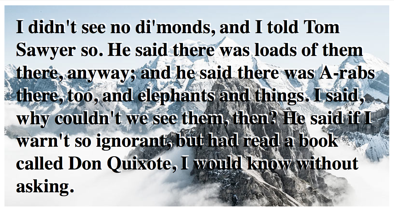
The best time to use a drop shadow is when there are multiple colors behind your text. This often happens when you overlay text onto an image. If you have black text, it can get lost in the darker parts of your image, and vice versa. Adding a contrasting drop shadow color will allow the text to be more easily read.
The Property
The text-shadow property has four main values, horizontal position, vertical position, blur and color (inserted in this order).
text-shadow: 4px 2px 5px #444444;
- Horizontal Position: A positive number will move the shadow to the right, and a negative number will move it to the left.
- Vertical Position: A positive number will move the shadow down, and a negative number will move it up.
- Blur: This will blur the shadow, removing the hard edges.
- Color: Any color code can be used here to define the color of the shadow.
Activity
Here you can test out what you read, and achieve badges.
Activity Instructions
Match the image using the text-shadow property:
- Don't delete any of the HTML or CSS
- Add the text-shadow property with the correct values to match the image (notice the direction and color of the shadow)