Responsive Columns
Side by side
The box model
When creating responsive columns you will probably want to start by changing the box model so padding and borders are not added to the width. This will eliminate some headache as you try to calculate how wide each column should be. The following code make this change to the whole document, and should be inserted near the top of the CSS document.
*, *:before, *:after { box-sizing: inherit; }
Extra White Space
Inline and inline-block elements will have a slight space between each other when there is any space or line break in the HTML. This becomes problematic when trying to create equal columns. Each of these spaces is roughly 4px wide. To fix this we have to do three things: First, we need to put a box around the columns we are creating. Second, we need to set this box to have a font-size: 0px;. Third, we need to give all the children of that div a font-size: 1rem;. This essentially removes the spacing between tags, and adds spacing back between text inside any children.
font-size: 0px;
}
.class-added-to-box > *{
font-size: 1rem;
}
Setup generic column class
You will probably want to define some universal traits for each of the columns. This would include margins and display inline-block, but also could include background colors, borders, etc. Creating a generic rule for all columns will allow this to be quickly and easily changed in the future. The display inline-block allow the columns to float next to each other, and the margins add space to each side of each column.
margin: 1%;
display: inline-block;
background: gray;
}
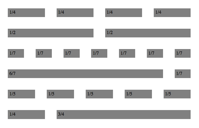
Specific column class
After you have a generic column class you will need to add a more specific class for each column size. Each of these will only need a width set with a percentage. It would be great if you could simply put 25% for a 1/4 column, but the margins still need to be factored in. For instance if you wanted four equal columns, that each had a 1% margin the width would be 23%. You can use this simple formula to get the width of any equal width columns
( (fraction) * 100) - (margin * 2) = width in percentage
In this case it would be ( (1/4) * 100 ) - ( 1 * 2 ) = 23
width: 23%;
}
Activity
Here you can test out what you read, and achieve badges.
Activity Instructions
Do the following:
- Change the column margin to 3%
- Recalculate the widths (onefourth, onehalf, oneseventh, sixseventh)
- Add another row with five equal columns
- Add another row with one 1/4 column, and one 3/4 column